BeyondGo
Dynamic global payment platform.
What i did
User Research
Wireframing
User Interface Design
User Experience Design
highlights
Revolutionising Cross-Border Payments
Diverse and Innovative Fintech
Financial Platform (Mobile and Web)
Overview
BeyondGo set out to build a new digital wallet and remittance platform for Southeast Asia - a region where many people send money to different countries, work across borders, or support family members in other places. The idea was to make transferring money fast, transparent, and stress-free, especially for users who may not be tech-savvy or familiar with financial apps. There was no existing interface, no UX patterns, and no design system.
I joined as the UI/UX designer at the very beginning, responsible for shaping the entire experience from scratch. My work started with understanding the people who would actually use the app: how often they transfer money, what makes them nervous, and what would make them switch from their existing payment method. From this research, I created detailed product requirements, mapped user flows, designed wireframes, and built a high-fidelity prototype. Through multiple testing cycles, the product evolved into a clear, intuitive, trustworthy wallet experience. The end result was a user-friendly financial app that allowed people to deposit money, send and receive payments, check exchange rates, and manage their balance without confusion.
User Research & Ideation
To build a product for users in different countries, I had to understand how money moves in real life. I conducted surveys, interviews, and competitor analysis focusing on behaviours, motivations, risks, and trust. The goal was to avoid assumptions and ground every feature in real human needs. Five user personas were developed based on this research:
• Foreign workers sending money home every month - Focused on fees, exchange rates, and fast confirmation
• Freelancers receiving cross-border payments - Needed speed, clear transaction breakdowns, and a simple way to request money from clients
• Families receiving funds from relatives overseas - Wanted reliability, notifications, and easy access to cash
• Local users making daily payments - Used wallets for QR payments, instant transfers, and splitting bills
• First-time digital wallet users - Needed simple wording, fewer steps, and reassurance about security
These personas weren’t just demographic profiles - they represented clear differences in behaviour. Some users sent money every month with fixed amounts. Others only needed the app occasionally. Some used banking apps confidently, while others were nervous about mistakes.
.png)
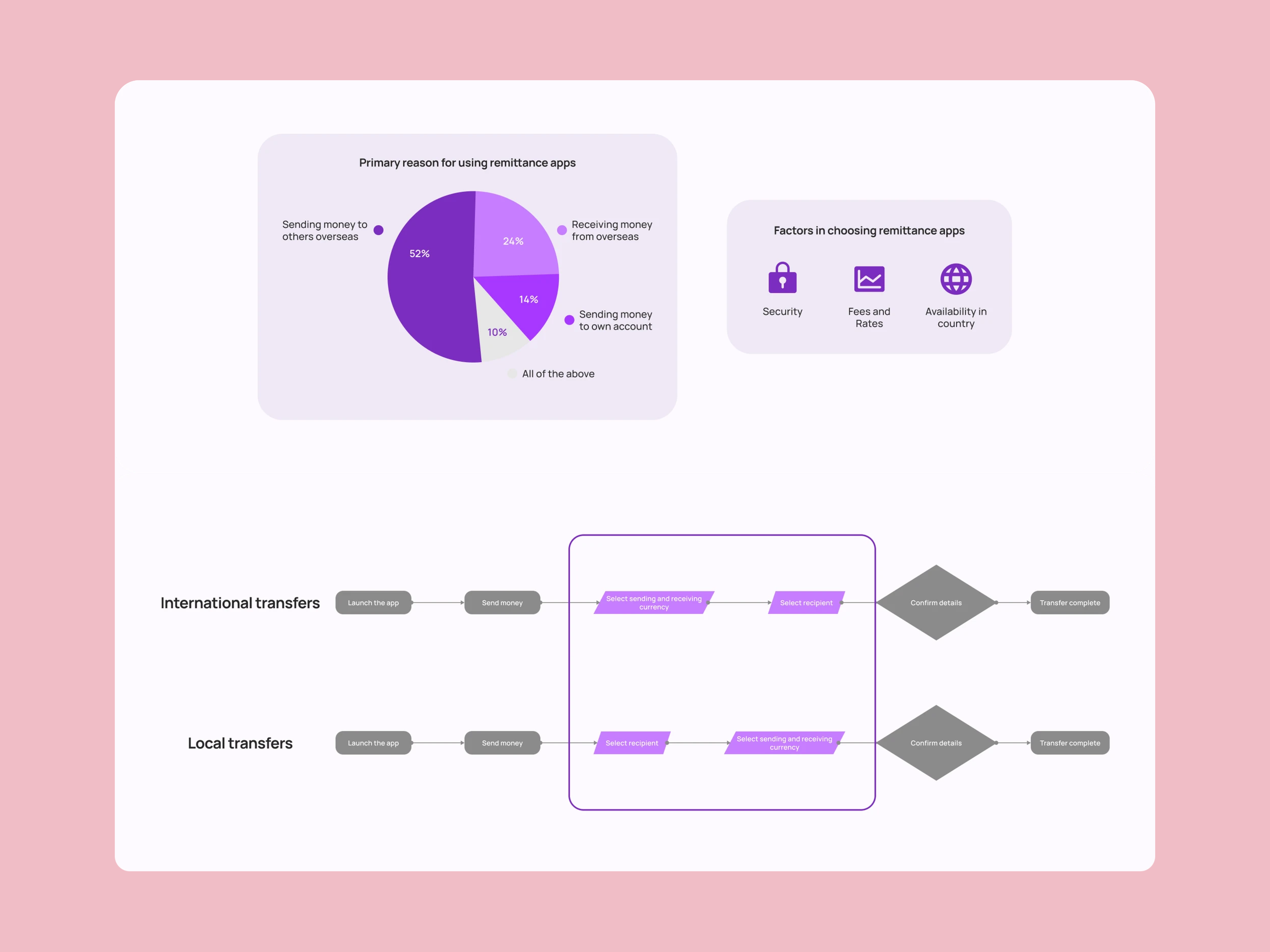
In surveys: 52% used remittance apps mainly to send money overseas 24% used them to receive funds The top decision factors were: security, fees/exchange rates, and availability in their country This research shaped the core product journeys: onboarding, identity verification, depositing funds, sending/receiving money, tracking repayments, and reviewing transactions. Every step was designed to minimise friction and remove uncertainty.

Wireframes & Design System
Once the product requirements and flows were clear, I started sketching screen layouts and turning them into wireframes in Figma. These early wireframes helped uncover potential confusion: unclear buttons, too many steps, or terminology that might not translate across different languages.

After the flows were validated, I designed the visual identity of the app. This included: Typography for clarity and readability Iconography for fast recognition A blue-based colour system that communicates trust, stability, and transparency Consistent spacing and component rules for developers The design system allowed the product to scale — every new feature could be built using the same components and patterns instead of reinventing screens again. This saved time for the engineering team and created a unified look and feel across mobile and web.

High-Fidelity Prototypes
I created a high-fidelity interactive prototype that showed the full user journey: onboarding, currency selection, transfer screens, recipient management, and transaction history. The prototype was detailed enough for stakeholders to click through and see the experience exactly as a real user would. This prototype became the foundation for:
• Usability testing sessions
• Design review with stakeholders
•Developer handover

In user tests, we observed where people hesitated, what they didn’t understand, and what questions they asked aloud. Many small improvements came from these sessions - simpler labels, clearer warnings, and more obvious success messages. Every change reduced friction and increased trust.

User Testing & Lessons Learned
Testing revealed several important lessons about designing financial products for a diverse audience:
• Transparency builds trust.
Users want to see the total amount, fees, and exchange rates before sending money. If anything feels hidden, they stop.
• Simple wording matters.
Finance can be intimidating. Replacing technical terms with plain language reduced confusion for first-time wallet users.
• Micro-education inside the app helps.
Tooltips, short explanations, and guides helped users feel confident without needing customer support.
• Speed isn’t enough - clarity is more important.
Users preferred slightly longer flows if it meant no surprises or hidden fees.
These insights shaped the final product into a wallet experience that felt safe and predictable. The redesign turned a complex financial system into a product that normal users could understand without training.
.png)